Virtual Labs for Pearson Education
Web | 2020 - 2021
How do we design and bring to market virtual laboratory simulations at scale?
OVERVIEW
In 2020 the education industry was upended as the Pandemic pushed students to remote and online spaces. Enrollment dropped and access to education became harder for prospective students.
Pearson acted quickly to develop new remote learning products to meet this shift in the industry. I was brought on board as the Design Director to establish the design and interactions of 7 initial virtual laboratory simulations focusing on STEM subjects. These 7 labs explored the challenges of interactive labs, worked out the bugs, established workflows, and created future processes. What we learned here laid the infrastructure for many more scalable labs in the future.
MY ROLE IN THE TEAM
1. Initial Research and the User
I managed the initial team that would go on to visualize and design the virtual labs. I established the scope and goals of the project by meeting with stakeholders, the product design director, product managers, developers, and engineers. I also met with the sales and commercial team leads to discuss competitor analysis and user personas. This was an important step in ensuring the labs met the needs of teachers and students, as well as meeting Pearson’s goals in the education market.
The first labs would be designed for new college students that were non-science majors. For many students this would be their first exposure to college-level science. We couldn’t count on them having previous scientific knowledge from their education. I made it a central theme that these first labs should above all be accessible, approachable, and engaging to science newcomers.
Professors and instructors are the other important group we identified because they are the ones choosing and assigning these products in their classes. Based on early interviews and research we knew the labs should be a flexible template split into distinct sections. Instructors could then modify or augment the labs so they could integrate the product into existing lessons. Nonetheless each lab was built to be a standalone product usable out of the box.
2. Prototyping, Ideation, Exploration, and Early Concepts:
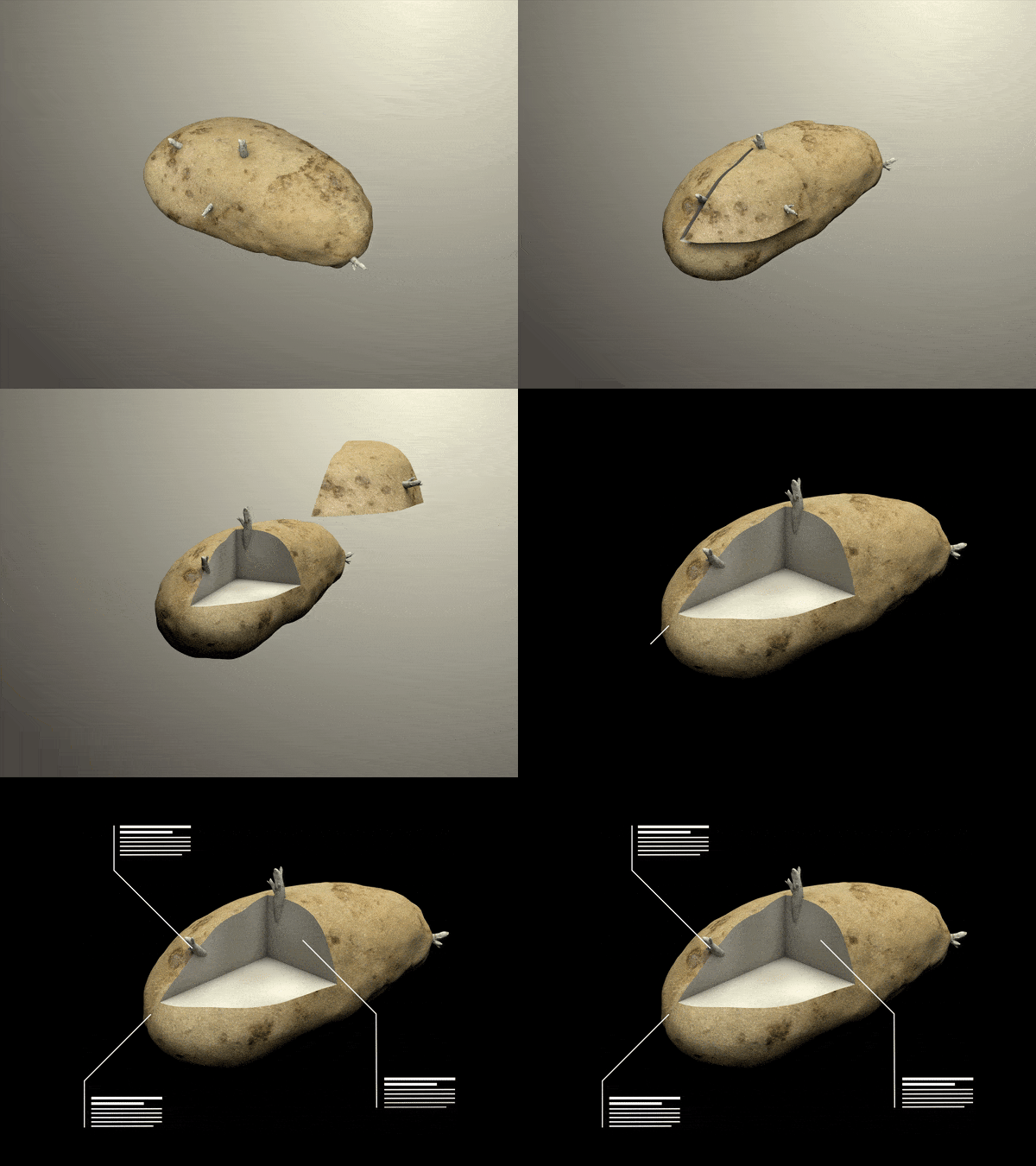
I championed the implementation of video and animation to catch the student’s eye and create an immersive introduction to the lab. Initially I looked into VR and fully interactive 3D, but abandoned it due to time, cost, and low return for the high investment costs. Sometimes you get to a good idea by coming up with a few bad ones first.
Early 3D animation and interaction concepts.
Wireframe Sketch
Final Design
Layered View
3. Execution:
Introduction
I coalesced the best ideas and concepts from the rapid prototyping phase and created a multimedia rich introduction to the labs. For many students these lab introductions are their first exposure to college-level scientific concepts. They are designed to be approachable, engaging, and to tell an interesting narrative through real world examples. I worked closely with Learning Designers and Subject Matter Experts to craft a compelling and scientifically accurate story. Starting with a simple design brief from the Learning Designer, I fully visualized and executed the designs to bring the science lab to life.
Osmosis Introduction
Design Brief Storyboard
Final Design
Pre-Lab
The Pre-Lab section comes after the introduction. It teaches students about the core concepts of the lab and tests their knowledge. I collaborated with Learning Designers to ensure the visual design of the lesson was scientifically accurate and engaging.
Osmosis Pre-Lab Lesson
Interactive 3D models guide students through complex concepts, step by step.
Carbon Cycle Interactive 3D Model
Design Brief
Lab Simulation
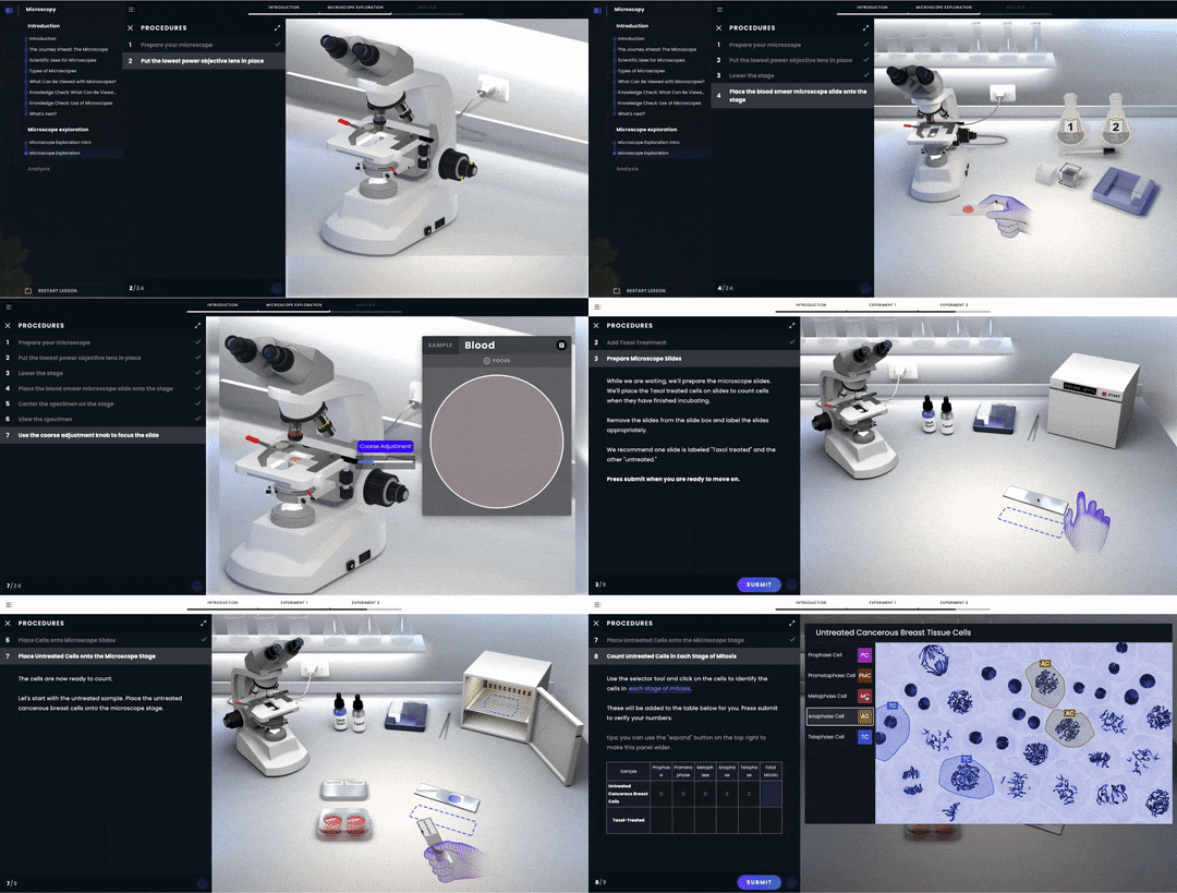
I worked with developers and engineers to create the art assets and interactions that a student will use to perform the actual scientific experiment. Care was taken to make sure everything was scientifically accurate and easily identifiable. File sizes for images and animations were optimized to be as small as possible so the lab would be responsive and load quickly for users with different internet speeds.
Mitosis Lab Design Brief
Mitosis Lab Storyboard
Mitosis Lab Final Sim
Microscope Lab Final Sim
4. Established a Standard Process and Design Template
I setup initial workflows, processes, and designs that would become the foundation for future virtual labs:
Set up folder hierarchies and naming conventions
Organized files, designs, and templates across numerous Figma projects
Tracked work, files, progress, and issues through Pearson’s Jira ticketing system
Checked and uploaded final asset deliverables to Pearson’s content management system for developer hand-off
Lab Interaction
Early on in discussions we decided a hand icon would be important for students to easily navigate and interact with the lab space. Hands are immediately familiar and can give the user contextual clues on what is happening, and what to do next. We went through a few iterations before settling on a neutral color with transparency so the user can see important lab items behind the hand. Animations show important steps and procedures. For example, it can show how to properly use tweezers to flip a glass coverslip with a sample on it.
Interactive Hand Evolution
Early sketch
Initial 3D model
Final with transparency
Final holding slide
Interaction Animations
Animations are simple, concise, and clear to show proper technique
Graphic Footer
Every lab has a unique graphic design footer inspired by the scientific topic. These elements immerse the student in the subject matter and establish the theme throughout the lab.
Lesson Questions and Components
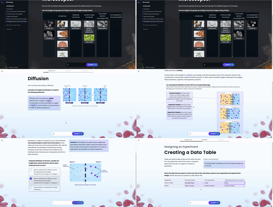
Standardizing different lesson components like mix and match questions, multiple choice questions, and graphs make designing labs quicker, easier, and flexible. A lab Learning Designer can combine the right lesson components and modules to create the appropriate lesson for the scientific subject and the right class level.
Drag and Drop
Graphs
Labeling
Complete Statement
Definition Matching
Multiple Choice
5. Accessibility and Testing
I worked closely with the Pearson accessibility department to ensure the labs would be accessible for as wide a variety of users as possible. A workshop with blind, low vision, and physically impaired individuals helped my team think of ways to improve the experience of the labs.
Highlighting
Important lab items are highlighted when hovered over to draw and focus the eye. Dashed outlines give the user a hint where an item will be placed.
Highlight Off/On
Placement Indicator
Contrast
We routinely checked that text was readable and met the Web Content Accessibility Guidelines (WCAG) 2.1 throughout the design process. The ‘Contrast’ plugin for Figma made checking text color contrast fast and easy. It was a crucial tool on short deadlines.
Navigation and Feedback
A persistent progress bar tells students where they are in the lab and allows them to save their place in the lesson or return to a previously completed step. The feedback button is where all direct communication with the student happens. It can tell the student if they are incorrect, give them hints to an answer, provide context for a completed action, or just give them words of encouragement.
User Testing
We used UserTesting.com for all stages of product testing. Subscription access meant we could test freely at every stage of development. We fostered an environment where we tested frequently and often, everything from concepts and prototypes to MVPs and A/B testing. This was the most crucial step because it showed how the labs would be experienced by actual users. Navigation, 3D designs, lessons, and layout were all shaped by testing. We chose UserTesting because it had the most robust testing tool set and a large user base to pair the most ideal set of users with a particular prototype.
THE IMPACT
In one year my team built 7 fully functioning labs that exceeded the initial goals laid out. These 7 labs established the navigation structure, the visual aesthetic, and the overall template for hundreds of simulated science labs to follow as Pearson expands its digital first products.
I was brought on at a time when Pearson’s competitors already had successful virtual lab products on the market. My team quickly and efficiently developed Pearson’s virtual labs to maintain competitiveness.
“Building the plane as it flies,” was the mantra I heard from stakeholders throughout this project. As the lead Art Director and Designer I hit the ground running and quickly integrated with project managers, learning designers, researchers, developers and other designers.
Creating a library of lab lesson components and modules streamlines the lab creation process. Learning Designers choose from an expansive component catalog to quickly make the right lesson. Breaking up a lab into blocks also allows a professor to use parts of a lesson to tailor the lab to their particular needs.
Building the initial prototypes in house is crucial to maintaining the quality and vision the team and stakeholders laid out for this project. The process for creating future labs can now be scaled up and outsourced to vendors.


